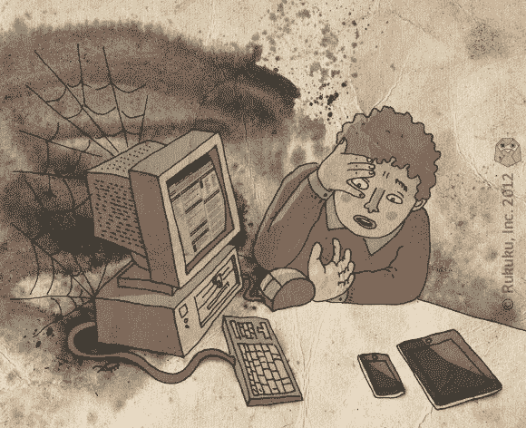
As of 2008, over four million US students in postsecondary education – that’s 20.4% – were taking online distance learning classes. Are today’s distance-learning platforms adequately addressing the needs of online learners?
In this post I’d like to focus on the 800-pound gorilla of the market: that is, of course, Blackboard.
Very recently, I took an online course on Blackboard. I found the interface to be wonderfully interactive and conducive to learning. As soon as I logged on, I was smitten by its user-friendliness, humbled by the profound student-professor rapport it establishes, and downright awestruck at its productive learning process.
Wait a second. No I wasn’t.
The interface on Blackboard looks a bit like it was designed by someone constantly referencing their “Intro to C++” textbook. Actually, that explains a lot: the interactivity level of the site closely resembles a textbook as well. The way a course is organized on Blackboard lacks any direction or purpose. With tabs on top, tabs on the right, boxes here and there, and a pervasively gloomy brown-ness throughout (you’ll find more cheer in a Franz Kafka novel), the user experience is far from easy. Not to be outdone, the actual performance of the program is fantastically… mediocre.
Maybe this is harsh. After all, there’s nothing wrong with Blackboard. The problem is that there’s nothing right with it either. It doesn’t engage, it doesn’t excite, and it doesn’t inspire. It’s as interesting and sophisticated as, well, a blackboard.
Shouldn’t a learning platform make me want to learn something?

