What’s in the name of our company. Part five: Designing the mascot

Continued from the previous post on the topic.

Fitting an image to fit the perception

Once all the number crunching was done and we were certain that “rukuku” would be our brand, we set to design the image. We needed to marry the ideal etalon brand qualities with those perceived to be attached to the word “rukuku”.  We soon realized that the main challenge was to come up with an interactive solution that was also easy.  Looking at the list of perceived brand traits in the previous post, it becomes apparent that we also needed to link some very contradicting traits: male and female, aggressive and cute, facetious and serious, etc. This was becoming really fun!

Our mighty design and programming team is exceptionally strong. Our graphic design work is led by a world-class illustrator, graphics designer and book author Oleg Tischenkov (you should definitely buy his fun interactive book for iPad). Here’s how the process went:

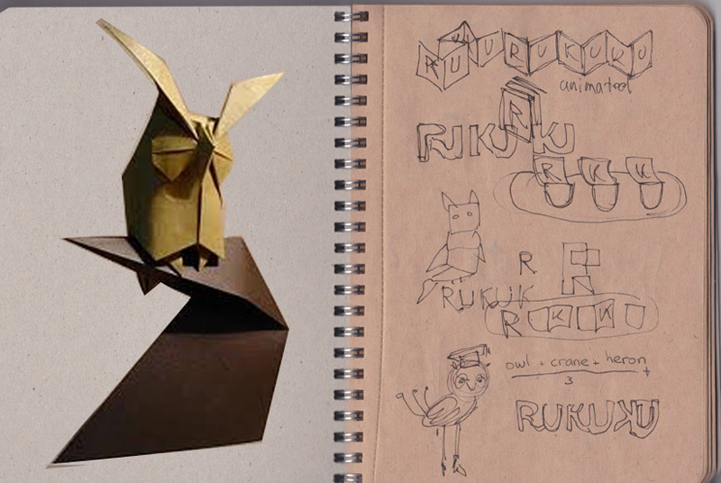
First sketches
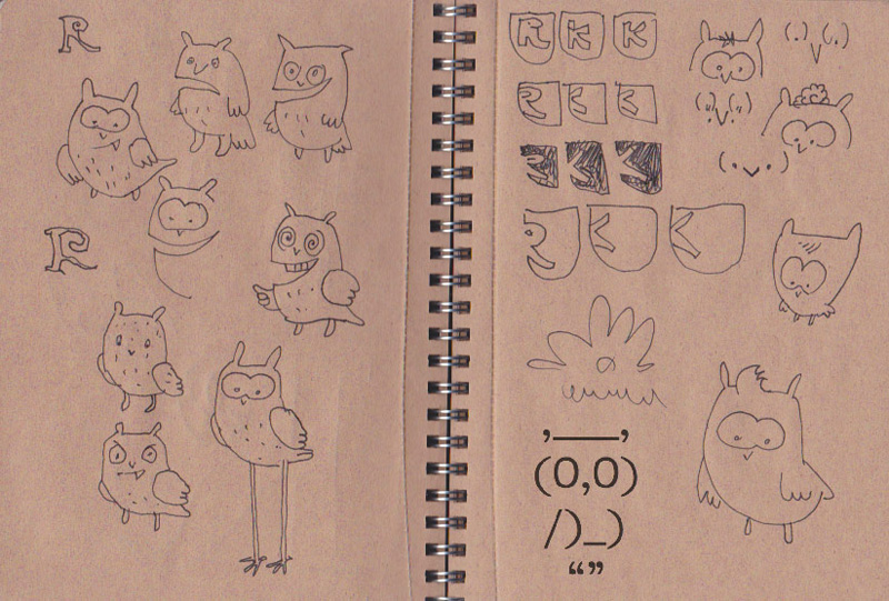
Hm… this sort of looks like an owl with teeth; owl is a bird, but a weird one, and it is generally considered smart. Good idea. Where’s the interactivity we need?
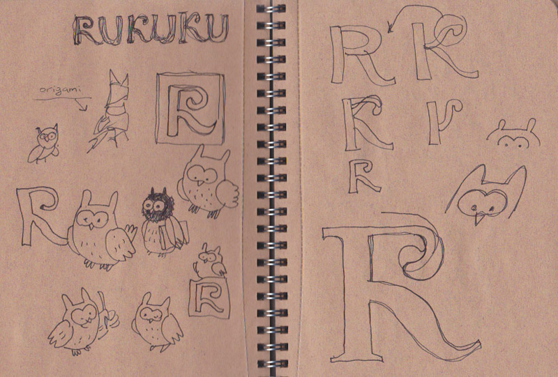
This origami idea is brilliant! It is as interactive as it gets: anyone can make our logo themselves and interact with it. Plus, origami is Asian, it can be both puzzle and art, and it is fun, and can be easy!  This is an ideal solution.

That’s the direction we should go—origami owls. Let’s see what is there in the world of origami owls. Google search reveals hundreds of paper owls, and we like three of them. The idea is to use one of these designs as a basis for our own design:
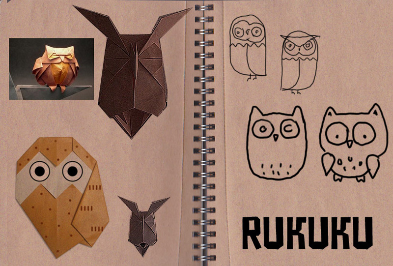
All of them look adorable. The next challenge is to choose the one that is ideal for us. The perception histogram for the ideal emphasized easiness, so that’s what we decide to test, and for a couple of days we folded dozens of owls.

The one with long horns (“mimizuku” in Japanese) by Hideo Homatsu is absolutely stunning:

Let’s try to fold one:

This takes some persistence and skill, but we do not give up:

Finally, we make a bunch of those mimizuku’s, and the results are disappointing. While Hideo Homatsu’s is a brilliantly designed origami owl, it is not easy one. Reject!

Next in line is Fumiaki Shingu’s design:
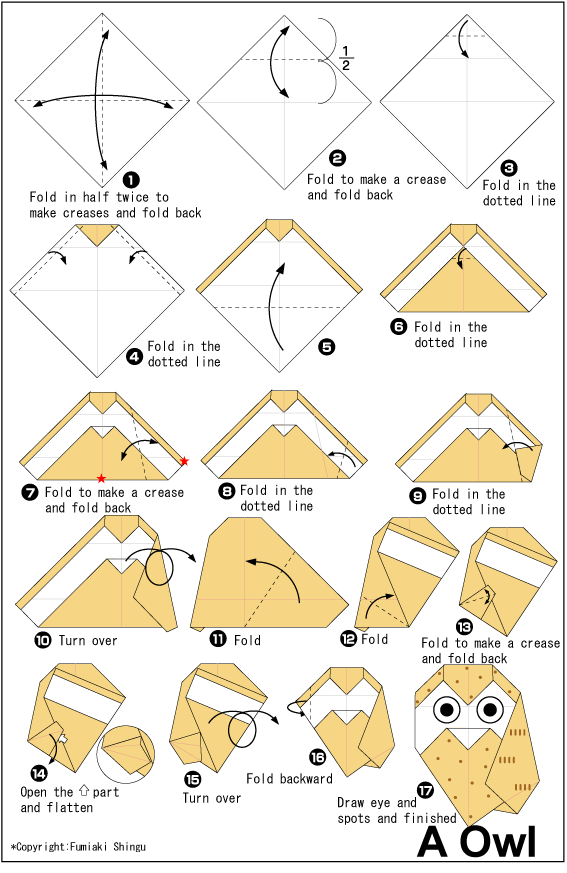
This is much easier—a good candidate for modification.

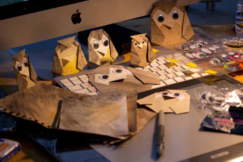
What did we like in the difficult one? It was a mimizuku, i.e. the horned owl, and the horns gave it a mildly aggressive look. We liked its three dimensional eyes and the symmetry of the design. However, Fumiaku Shingu’s owl is definitely facetious, cute and just lovable. Let’s play with it futher and give it the qualities we liked in the mimizuku:
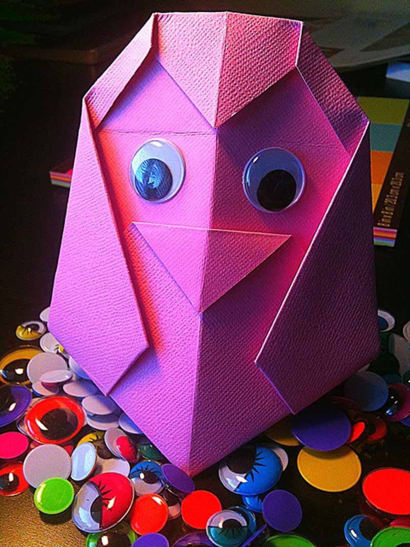
We discover that with a profound change to the design the owl can be put on its feet. Great! We love more interactivity—the Rukuku Owl can be placed on a desk or a bookshelf as a decorative object. Three dimensional blister eyes are great, but the owl is almost too cute. We need to make it a horned owl. The solution is simple: make small cuts in the folded edges above the eyes and unfold the horns. Done:
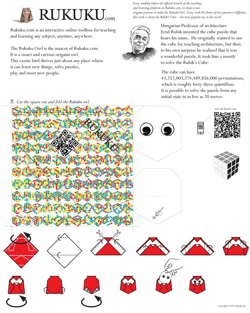
Now we need folding instructions for the Rukuku Owl. They have to be easy, but not too easy. We go through several versions of the folding instructions, use our friends as test subjects, and settle on the one below:
Finally, we were completely happy, and our super smart lawyers filed for copyright protection. Done.

Stay tuned! Tomorrow’s post will be about our approach to user interface design.

What’s in the name of our company. Part four: survey analysis

Continued from Part three on the same topic.

Survey design

We did several surveys to test several new words from the list of neologisms. Only one of them yielded satisfactory results, leading to the conclusion that “rukuku” was the best candidate from our list to be used as a brand for our education marketplace.

The surveys were deliberately split into 4 sections. They each started with five prompts about the new, unknown and seemingly meaningless word, e.g. “rukuku”. Each prompt tested a certain perception: What is this word and what isn’t this word? How close is it to the animate world? What is its personality?

The second section of the survey introduced a less unfamiliar word, e.g. “edpanel”. It is less unfamiliar because both “ed” and “panel” are English words with meanings. We were careful not to create context and mention technology, commerce or education marketplace so that the perception of the words could be tested independently of any context.

The third section was there to help us understand the ideal qualities of an etalon brand, and the fourth section was a quick research into the demographics of the respondents.

Survey results

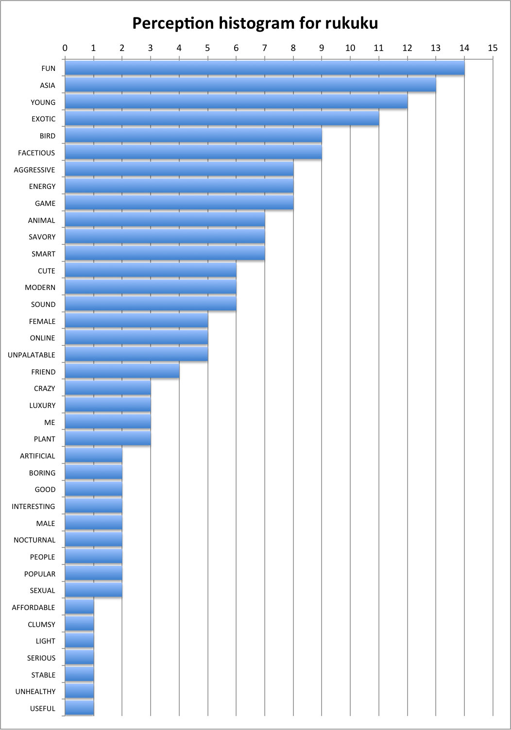
The theory behind the minimal semantic unit held. Out of several dozen responses about “rukuku” only one respondent said they had no clue what the word meant. After processing the responses, we saw that a vast majority of people regardless of age, gender, occupation or geography (we mapped the IP addresses of the respondents) had consistent feelings and mental imagery associated with “rukuku”. Here is what we discovered—the x-axis represents relative strength of the perceived trait:

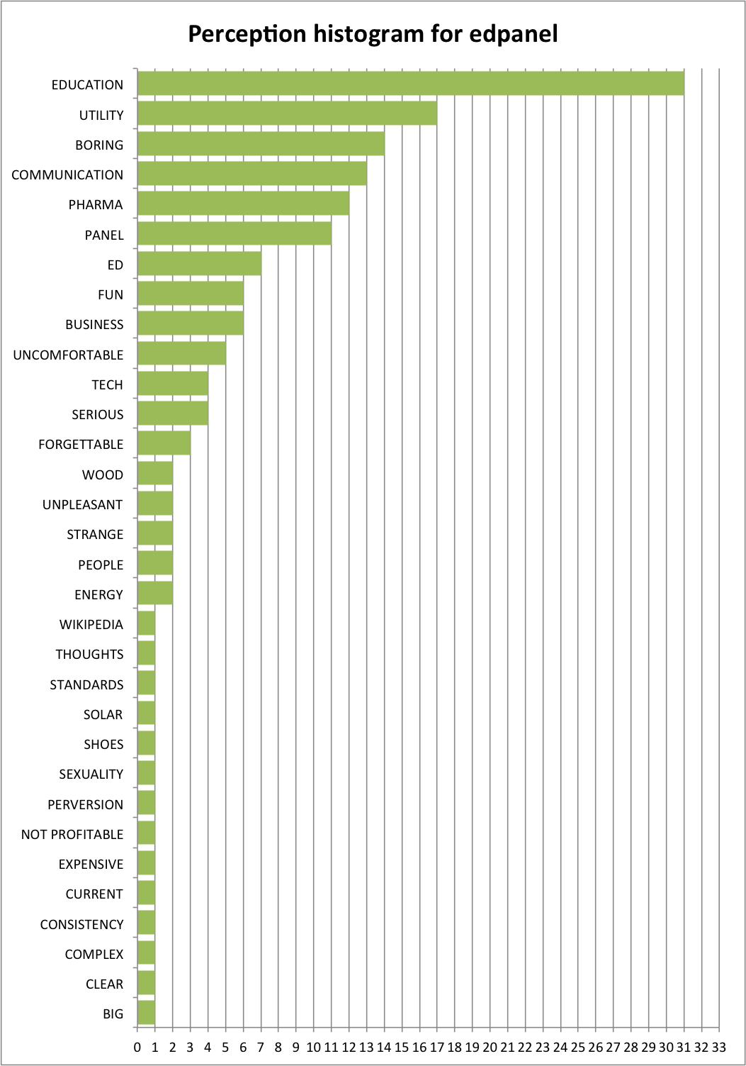
The less unfamiliar word yielded a different result:

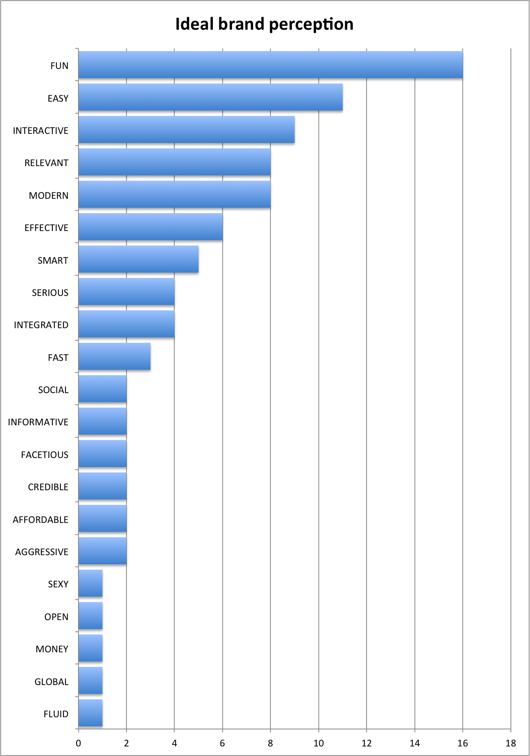
The most surprising discovery, however, was that the ideal brand for an educational web resource in the minds of our respondents did not have to directly signal that it is related to education at all! Here’s what the market really wants to see:

Most and foremost, the market wants the brand to be fun, easy and interactive. The respondents also clearly want to relate to the brand. Back at Wharton my exceptionally talented learning team developed a super effective methodology for conjoint analyses when we played the SABRE game.   I used these tools to analyze which of our candidate names (if any) were suitable. The result of the analysis was that “rukuku” was the closest to the ideal out of all the words subjected to the perception test.  The word “rukuku” appears to be predominantly fun, young, aggressive, energetic, and smart. We then decided that the strong perceived traits of the word’s Asian origin, liveliness and cuteness as well as the numerous direct connotations to the fauna offered a great foundation for creating a brand that the users could feel connected to.

With this wealth of information in mind we set to design an image that would both reflect the perception of the word “rukuku” and emphasize the etalon qualities of the ideal.

My next post on Monday, May 21 will describe the design process in detail. Stay tuned, ask questions, like us on FB, tweet about us and sign up for launch.

Edtech must have: good design

Ever wondered why most education related web resources are adorned with images of apples, rulers, chalk, and yellow pencils? To me these are signals of bland obscurity in design.  I see a yellow pencil on an “ed tech” page—these are usually borrowed from a kitsch clip art library—and I know that whoever was in charge of that project did a bad job. They did not think through even the key details of the design, let alone the more important minute details.

With very, very few exceptions, anything that is rolled out nowadays in the education space on the web is done without much consideration for usability or user experience. Or in plain English, web ed tech design sucks.

Really bad design is a big problem that permeates the education space.

Our team understands this problem very clearly, and we are striving for a magical user experience. Thus, users and their satisfaction with all aspects of our service—from User Interface to quality of content—are right at the core of our design effort.

Dieter Rams formulated ten axioms of good design. Although his rules were meant to be directly applicable to designing new objects, these are applicable in web design:

  1. Good Design Is Innovative—The possibilities for innovation are not, by any means, exhausted. Technological development is always offering new opportunities for innovative design. But innovative design always develops in tandem with innovative technology, and can never be an end in itself.
  2. Good Design Makes a Product Useful—A product is bought to be used. It has to satisfy certain criteria, not only functional, but also psychological and aesthetic. Good design emphasizes the usefulness of a product whilst disregarding anything that could possibly detract from it.
  3. Good Design Is Aesthetic—The aesthetic quality of a product is integral to its usefulness because products we use every day affect our person and our well-being. But only well-executed objects can be beautiful.
  4. Good Design Makes A Product Understandable—It clarifies the product’s structure. Better still, it can make the product talk. At best, it is self-explanatory.
  5. Good Design Is Unobtrusive—Products fulfilling a purpose are like tools. They are neither decorative objects nor works of art. Their design should therefore be both neutral and restrained, to leave room for the user’s self-expression.
  6. Good Design Is Honest—It does not make a product more innovative, powerful or valuable than it really is. It does not attempt to manipulate the consumer with promises that cannot be kept
  7. Good Design Is Long-lasting—It avoids being fashionable and therefore never appears antiquated. Unlike fashionable design, it lasts many years – even in today’s throwaway society.
  8. Good Design Is Thorough Down to the Last Detail—Nothing must be arbitrary or left to chance. Care and accuracy in the design process show respect towards the consumer.
  9. Good Design Is Environmentally Friendly—Design makes an important contribution to the preservation of the environment. It conserves resources and minimizes physical and visual pollution throughout the life cycle of the product.
  10. Good Design Is as Little Design as Possible—Less, but better because it concentrates on the essential aspects, and the products are not burdened with non-essentials. Back to purity, back to simplicity.


Needless to say, when we launch Rukuku services, you won’t see rulers, pencils, or red apples for that matter.

What’s in the name of our company. Part three: defining market ideal

Continued from previous post (Part 2) on this topic.

Extracting Pearls of Wisdom

Remember how I said that there is only a grain of truth in the notion that everyone is a genius brand name generator? I stand by my word—my thought process is as follows: since the domain name and brand have to fit the intended purpose, not all the names you come up with will be ideal or suitable for that purpose, i.e. some names are more appropriate for what they are intended than others.  With this in mind the task shifted to understanding whether any of my candidate names were any good to be used as a name for an education marketplace. Here’s what I did:

  1. Narrow the list down to two names—I simply talked with a couple of dozen people or so and asked them to rate the names I had “good” or “bad”. The goal was to understand if the neologisms on my list sounded pleasant and evoked positive emotions. The two that emerged as champions with the largest number of “good” ratings were the ones that I subjected to the next study.
  2. Understand the qualities of the ideal name—In order to understand what qualities the consumers perceive as must-have in the etalon ideal name for an online educational resource, I simply collected over a 100 responses through a questionnaire on Survey Monkey
  3. Understand the qualities of the candidate name—the same survey achieves this goal. The questionnaire is still active, so go ahead and submit your answers before reading further. The whole process takes about one minute: http://www.surveymonkey.com/s/LJVGKK6

The goal of that questionnaire was to present the new words and collect adjectives based on spontaneous reactions, and associations with these meaningless words. The way my survey is deliberately organized in its present form and sequence, and I will explain the rationale behind this design on Friday, May 18.

My next post however, on Thursday, May 17, will be about the state of things with design in web education technology. Stay tuned!

Tomorrow is a historic day for Silicon Valley:  Facebook will go public.  I want to wish this great company tons of luck in their IPO.

What’s in the name of our company. Part two: no auction, please.

Speculators and Dutch auctions

Knowing that domain names may indeed have a high fair market price and value, I was not sure whether the price quotes I got from the speculators were actually fair.  I concluded that domain names had a subjective situational value behind them.  My observation is that good speculators know this to be true, and so they engage in a form of a Dutch auction: they always bluff initially, start with a high price and then reluctantly reduce it in small increments to a level that can be accepted by the interested party.

Prof. Keith Weigelt who taught my Managerial Economics class at Wharton is a big fan of auctions: he proves that auctions are a great tool for extracting maximum value from the market. Combining the Dutch auction approach with the asymmetry of information on the domain name market gives the speculators a wonderful opportunity for perfect price discrimination, i.e. whatever price is paid by an individual for the domain name is always the maximum price that this individual can afford. This means that no price quote from the resellers was ever going to be fair, and I would always be taken for a ride. This is what Nassim Taleb would probably call “the sucker’s game”, and it certainly was not something I wanted to engage in.

This led me to the conclusion that I should avoid the resellers altogether and not waste money (as should anybody who wants to register a domain name) and instead find a different way to solve this problem.

Asymmetry is the solution

So I looked at all the wildly successful web companies, like Zynga, Twitter, Google, Yahoo! or Pinterest, and concluded that the brands they chose—let’s just agree that web domains are brands—did not represent gaming, micro blogging, search or social media before they attached the meaning to these bizarre words. If someone said “zynga” in 2000, it would be just an empty sound, and not be synonymous with anything. By the same token, the word “google” meant nothing in 1997, etc. However, even back then these words would evoke a “feeling”, which could be a foundation for branding.

Therefore, avoiding speculators and auctions was possible only by beating them at their own game by going totally asymmetric and contrary to popular belief.

I needed to achieve three goals:

  • understand what kind of brand the market truly wants
  • understand the true potential of the semantics of the names on my list, i.e. understand if any of the “cool” brands were at all appropriate and applicable for the cause
  • avoid paying a high price for the domain

I decided to play with the following concepts from linguistics and marketing:  minimal semantic units, semi-words and conjoint analysis (Prof. David Reibstein‘s SABRE game at Wharton proved very useful and practical). To put simply, my idea was to do the following:

  1. Come up with a new list of seemingly bizarre neologisms consisting of two or three minimal semantic units. This way, the chance that the speculators are holding these domains is very, very slim.
  2. Understand what qualities the market seeks in a domain name for an educational marketplace, i.e. define a semantic etalon with the ideal qualities that a brand like this should have.
  3. Test if any of the neologisms from the new list are close to the ideal, and choose the closest one.

So that’s what I did, and in my next post I will describe the process in more detail.

Stay tuned for more details on Wednesday, May 16.

The world would be a better place if Prof. Nassim Taleb could teach Antifragility on Rukuku

I am a big fan of Nassim Taleb‘s books, in fact I have read and re-read all of his books, and the reference section from the Black Swan has become my shopping list so that I can get yet more insight into what Dr. Taleb has been exploring.

When I first envisioned the mechanism that is in the core of Rukuku.com’s class editing engine, I did not know that I essentially cooked up a system based on a fractal.  I dug into the math of permutations and combinations, and this then led to the discovery that I was dealing with a fractal.  Long story short, it was Nassim Taleb who spurred my interest in Benoit Mandelbrot’s research. We still do not know how the Rukuku fractal will develop when Rukuku opens its doors to the public, but the interface of the class editing tool is truly amazing:  it is intuitive, simple and versatile at the same time.

My dream is that one day Prof. Nassim Taleb could author and teach something in the lines of “Antifragility 101” or “Non-Gaussian Finance zn+1 = zn2 + c” on Rukuku.com.

We will definitely invite him to use Rukuku, but for now we can just continue to learn in passive “observatory” mode, i.e. watch a video. Here’s his lecture on Antifragility filmed at his and my alma mater in 2011.

And stay tuned for Part 2 of the “What’s in the name of our company”—the post is coming out in 24 hours as announced.