Why move offline models online?

I am amazed that so many education-oriented startups work so hard to move traditional educational models online.  To me, the whole point of doing anything education-related on the web is in the ultimate disruptive power of the Internet.

Why bother with emulating offline models when something previously impossible can be created to compete with tradition?

User Interface colors

Color is a powerful tool in interface design.

Jef Raskin’s book I mentioned in my previous post devotes a long chapter to “Modes“. These are “a significant source of errors, confusion, unnecessary restrictions, and complexity in interfaces”. A simple example of mode would be how the “shift” key on your keyboard works:  pressing “Shift” with a letter key results in a capital letter, but “Shift” and a number key produces a completely different symbol.  The author talks about different modal interface features and suggests a number of ways to avoid modality in interfaces.

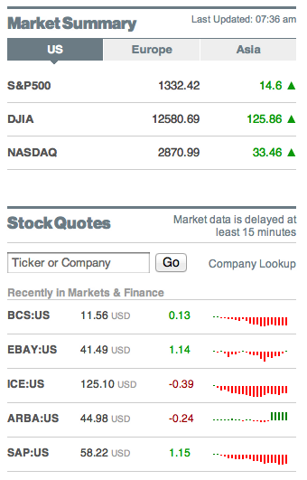
However there is very little about modality of color. There is cultural modality, i.e. colors have polar meanings in different cultures. For example, Chinese stock market data displays use green for falling prices, and red for raising prices as seen on the official Shenzhen Stock Exchange website:

Western tradition has it completely the opposite way, i.e. red means loss of value and green means growth in value as seen on Bloomberg.com:

If it weren’t for the triangles and the bars showing direction of the stock price movement, the colored numbers of the Shenzhen Stock Exchange alone would be confusing to most of the Western world, and the colored numbers on the Bloomberg website would confuse a lot of mainland Chinese.

Choosing colors for the interface should not be taken lightly as it can be a source of modality and sheer confusion.

At Rukuku, Inc, we are acutely aware of the ability of color to add modality to the interface, and we work hard to avoid such confusion. Our goal is to create the ultimate education marketplace that is a pleasure to use for anyone.

Read up on good interface design

As I mentioned in one of my earlier posts, web-based education services seem to have been infected by a virus of ugly design work.

Blackboard LMS (Learning Management Software) has such a complicated and confusing interface that people see business opportunity in designing a better, simpler LMS. There is a startup in New York that is doing exactly that.  For some reason, however, when the open source community decided to design Moodle LMS, they effectively created Blackboard’s ugly stepsister. These “designers” should first read up on interface design and put the potential user at the core of their design thinking!

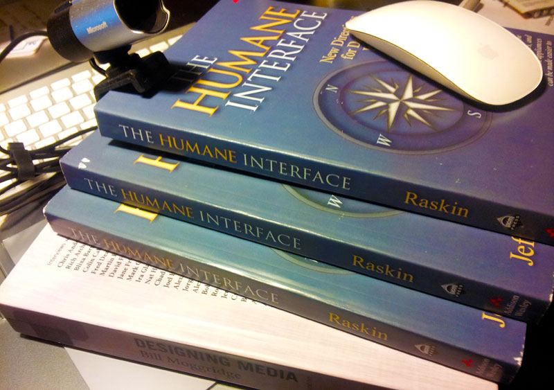
Jef Raskin’s classic book “The Humane Interface” is a good start for any start up. In addition, a nice foundation covering a broader topic of media design is Bill Moggridge’sDesigning Media” volume.


What’s in the name of our company. Part four: survey analysis

Continued from Part three on the same topic.

Survey design

We did several surveys to test several new words from the list of neologisms. Only one of them yielded satisfactory results, leading to the conclusion that “rukuku” was the best candidate from our list to be used as a brand for our education marketplace.

The surveys were deliberately split into 4 sections. They each started with five prompts about the new, unknown and seemingly meaningless word, e.g. “rukuku”. Each prompt tested a certain perception: What is this word and what isn’t this word? How close is it to the animate world? What is its personality?

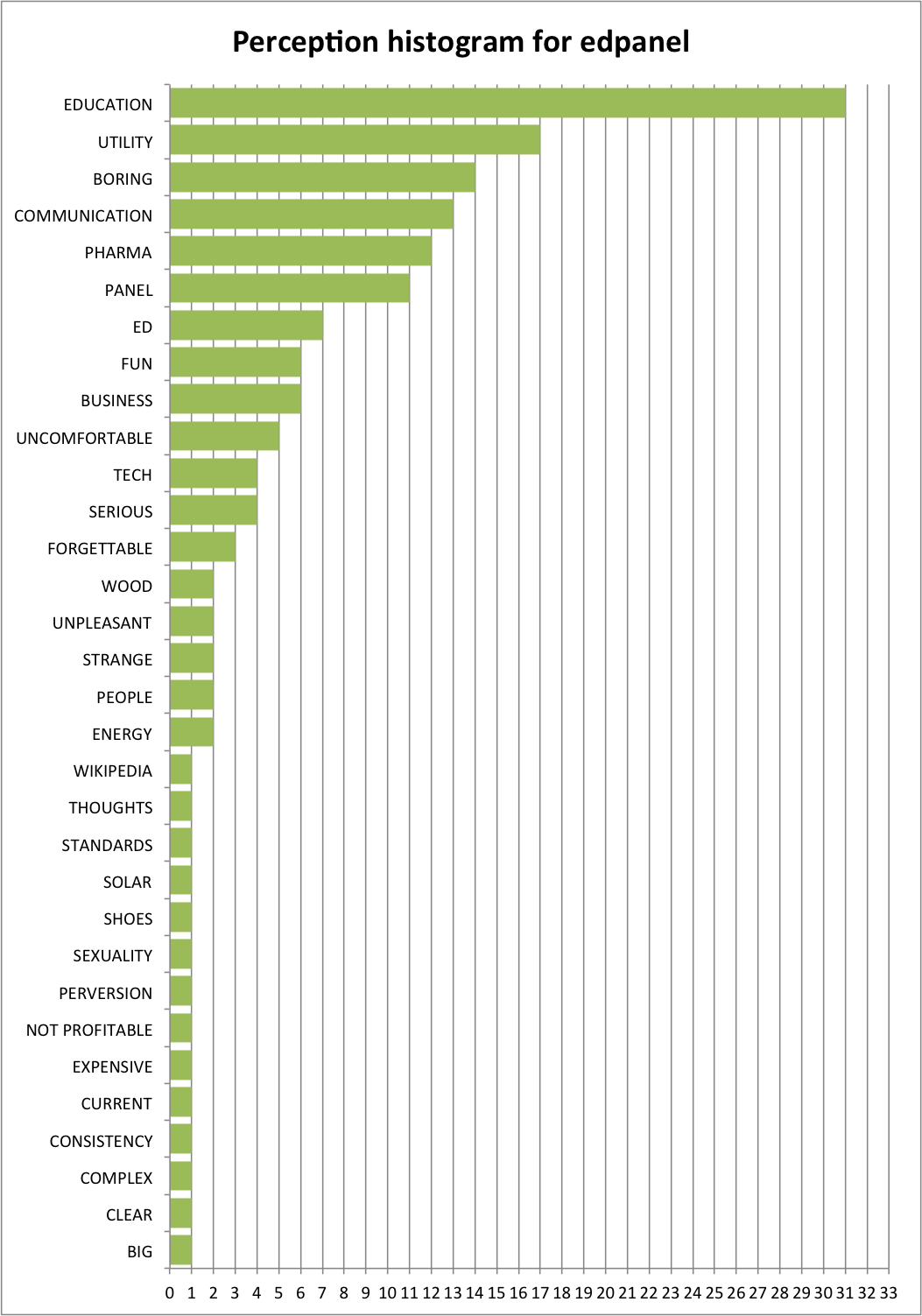
The second section of the survey introduced a less unfamiliar word, e.g. “edpanel”. It is less unfamiliar because both “ed” and “panel” are English words with meanings. We were careful not to create context and mention technology, commerce or education marketplace so that the perception of the words could be tested independently of any context.

The third section was there to help us understand the ideal qualities of an etalon brand, and the fourth section was a quick research into the demographics of the respondents.

Survey results

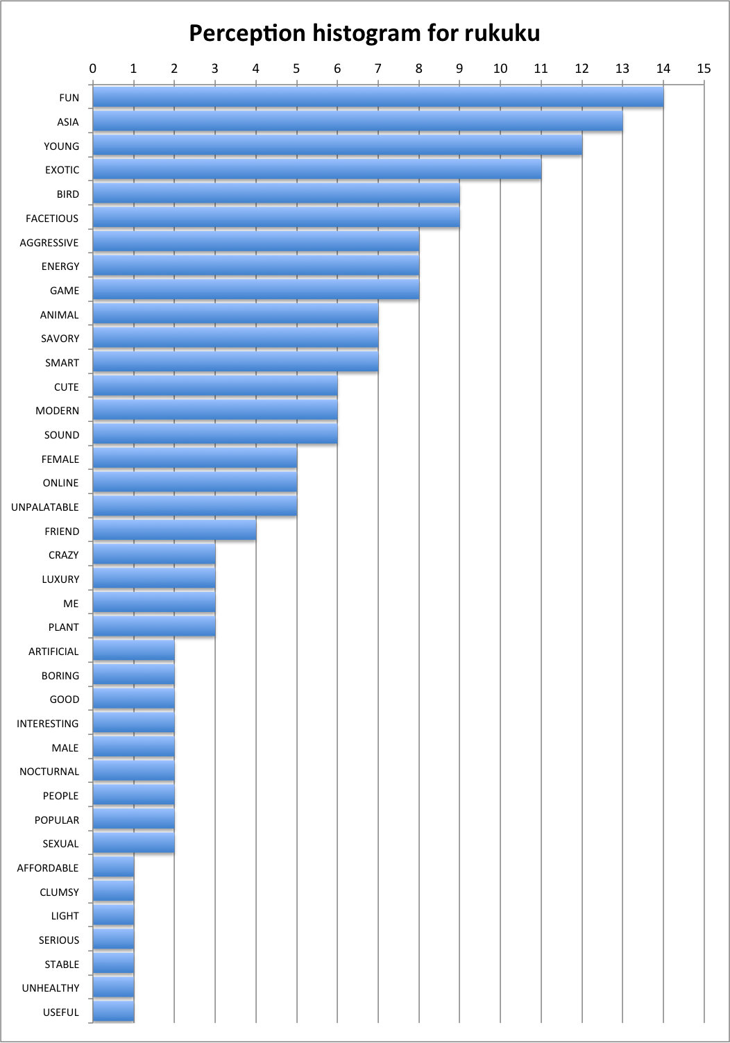
The theory behind the minimal semantic unit held. Out of several dozen responses about “rukuku” only one respondent said they had no clue what the word meant. After processing the responses, we saw that a vast majority of people regardless of age, gender, occupation or geography (we mapped the IP addresses of the respondents) had consistent feelings and mental imagery associated with “rukuku”. Here is what we discovered—the x-axis represents relative strength of the perceived trait:
The less unfamiliar word yielded a different result:
The most surprising discovery, however, was that the ideal brand for an educational web resource in the minds of our respondents did not have to directly signal that it is related to education at all! Here’s what the market really wants to see:
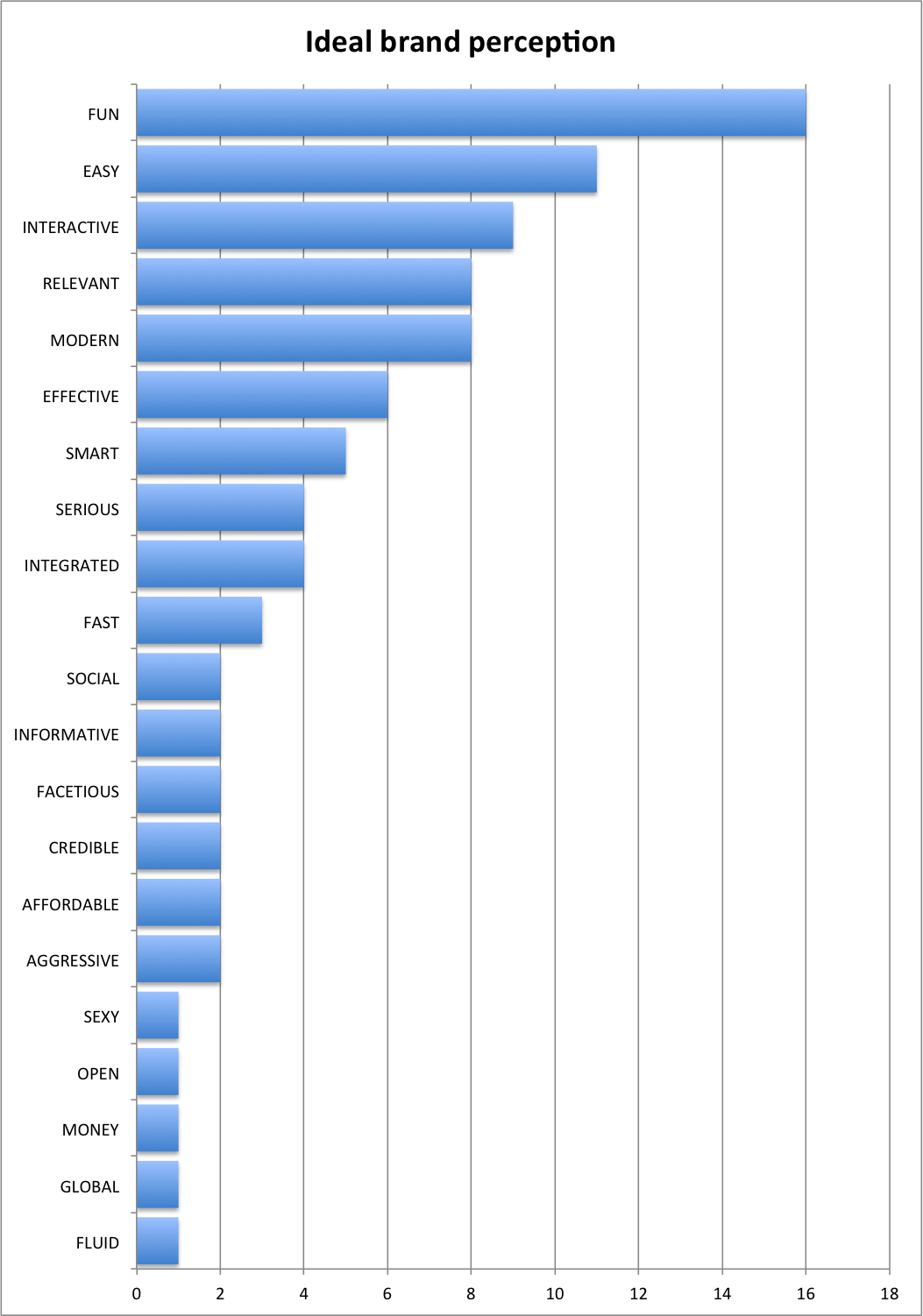
Most and foremost, the market wants the brand to be fun, easy and interactive. The respondents also clearly want to relate to the brand. Back at Wharton my exceptionally talented learning team developed a super effective methodology for conjoint analyses when we played the SABRE game.   I used these tools to analyze which of our candidate names (if any) were suitable. The result of the analysis was that “rukuku” was the closest to the ideal out of all the words subjected to the perception test.  The word “rukuku” appears to be predominantly fun, young, aggressive, energetic, and smart. We then decided that the strong perceived traits of the word’s Asian origin, liveliness and cuteness as well as the numerous direct connotations to the fauna offered a great foundation for creating a brand that the users could feel connected to.

With this wealth of information in mind we set to design an image that would both reflect the perception of the word “rukuku” and emphasize the etalon qualities of the ideal.

My next post on Monday, May 21 will describe the design process in detail. Stay tuned, ask questions, like us on FB, tweet about us and sign up for launch.

Edtech must have: good design

Ever wondered why most education related web resources are adorned with images of apples, rulers, chalk, and yellow pencils? To me these are signals of bland obscurity in design.  I see a yellow pencil on an “ed tech” page—these are usually borrowed from a kitsch clip art library—and I know that whoever was in charge of that project did a bad job. They did not think through even the key details of the design, let alone the more important minute details.

With very, very few exceptions, anything that is rolled out nowadays in the education space on the web is done without much consideration for usability or user experience. Or in plain English, web ed tech design sucks.

Really bad design is a big problem that permeates the education space.

Our team understands this problem very clearly, and we are striving for a magical user experience. Thus, users and their satisfaction with all aspects of our service—from User Interface to quality of content—are right at the core of our design effort.

Dieter Rams formulated ten axioms of good design. Although his rules were meant to be directly applicable to designing new objects, these are applicable in web design:

  1. Good Design Is Innovative—The possibilities for innovation are not, by any means, exhausted. Technological development is always offering new opportunities for innovative design. But innovative design always develops in tandem with innovative technology, and can never be an end in itself.
  2. Good Design Makes a Product Useful—A product is bought to be used. It has to satisfy certain criteria, not only functional, but also psychological and aesthetic. Good design emphasizes the usefulness of a product whilst disregarding anything that could possibly detract from it.
  3. Good Design Is Aesthetic—The aesthetic quality of a product is integral to its usefulness because products we use every day affect our person and our well-being. But only well-executed objects can be beautiful.
  4. Good Design Makes A Product Understandable—It clarifies the product’s structure. Better still, it can make the product talk. At best, it is self-explanatory.
  5. Good Design Is Unobtrusive—Products fulfilling a purpose are like tools. They are neither decorative objects nor works of art. Their design should therefore be both neutral and restrained, to leave room for the user’s self-expression.
  6. Good Design Is Honest—It does not make a product more innovative, powerful or valuable than it really is. It does not attempt to manipulate the consumer with promises that cannot be kept
  7. Good Design Is Long-lasting—It avoids being fashionable and therefore never appears antiquated. Unlike fashionable design, it lasts many years – even in today’s throwaway society.
  8. Good Design Is Thorough Down to the Last Detail—Nothing must be arbitrary or left to chance. Care and accuracy in the design process show respect towards the consumer.
  9. Good Design Is Environmentally Friendly—Design makes an important contribution to the preservation of the environment. It conserves resources and minimizes physical and visual pollution throughout the life cycle of the product.
  10. Good Design Is as Little Design as Possible—Less, but better because it concentrates on the essential aspects, and the products are not burdened with non-essentials. Back to purity, back to simplicity.


Needless to say, when we launch Rukuku services, you won’t see rulers, pencils, or red apples for that matter.

What’s in the name of our company. Part three: defining market ideal

Continued from previous post (Part 2) on this topic.

Extracting Pearls of Wisdom

Remember how I said that there is only a grain of truth in the notion that everyone is a genius brand name generator? I stand by my word—my thought process is as follows: since the domain name and brand have to fit the intended purpose, not all the names you come up with will be ideal or suitable for that purpose, i.e. some names are more appropriate for what they are intended than others.  With this in mind the task shifted to understanding whether any of my candidate names were any good to be used as a name for an education marketplace. Here’s what I did:

  1. Narrow the list down to two names—I simply talked with a couple of dozen people or so and asked them to rate the names I had “good” or “bad”. The goal was to understand if the neologisms on my list sounded pleasant and evoked positive emotions. The two that emerged as champions with the largest number of “good” ratings were the ones that I subjected to the next study.
  2. Understand the qualities of the ideal name—In order to understand what qualities the consumers perceive as must-have in the etalon ideal name for an online educational resource, I simply collected over a 100 responses through a questionnaire on Survey Monkey
  3. Understand the qualities of the candidate name—the same survey achieves this goal. The questionnaire is still active, so go ahead and submit your answers before reading further. The whole process takes about one minute: http://www.surveymonkey.com/s/LJVGKK6

The goal of that questionnaire was to present the new words and collect adjectives based on spontaneous reactions, and associations with these meaningless words. The way my survey is deliberately organized in its present form and sequence, and I will explain the rationale behind this design on Friday, May 18.

My next post however, on Thursday, May 17, will be about the state of things with design in web education technology. Stay tuned!

Tomorrow is a historic day for Silicon Valley:  Facebook will go public.  I want to wish this great company tons of luck in their IPO.