Three tips to make a good online course

Creating a good online course is an iterative design process with the end customer in mind.

Creating a good online course is an iterative design process with the end customer in mind

Online courses and webinars are becoming a good revenue source for the pioneers of the online learning revolutions that is unfolding in front of our eyes. The revolution is taking place right now, and we at Rukuku are in the middle of it all which is pretty exciting. In one of my previous posts, I talked about the independent instructor becoming the new success phenomenon in the world of media, and I concluded that the world of instruction will produce a lot of instructor entrepreneurs who will do well, and then there will be a small group of instructors who will do extremely well and have celebrity status.

The truth is anyone can be famous for 15 minutes with a course, but how does one get sustainable popularity? Here are three tips:

Make engaging and useful content
In the online training and education world the answer is no different than in any other media: an instructor has to generate fun, useful content. Remember the boring lectures at university that sucked the living soul out of you? That would never work online, and never make a course successful. The modern independent instructor needs to think in terms of entertaining their audience while training them. This thinking should permeate the design of the course as well as the presentation style of the instructor.

Less is more
Many large organizations are holding on dearly to their legacy e-learning content. At these organizations nobody is bothered that the traditional e-learning modules are badly designed: they are too long! This usually achieves one goal very well: numbing the mind of the course taker. The new knowledge that we have is that it is best to break up the courses into smaller chunks of 1 to 6 minutes long. This helps avoid learner fatigue as she moves from one logical chunk to another in a steady rhythmic way

Do niche marketing
Producing a course and formatting it in an appropriate way is only the first half of the job. The other half of the job is promoting the course and the instructor’s brand. For example, one of our instructors has figured out that her customers are best reached through professional associations so she started reaching out to these organizations on the phone and worked out a promotional deal whereby the associations became resellers of her courses. In essence the instructor found a good distribution channel for her content and invested in it by sharing revenue with the distributors. She then collected feedback from the many students that took her course and made improvements based on that feedback. Those who master the marketing and promotion game will stay relevant for years on end: good marketers know their target audience through and through, and that knowledge will then feed back into content production and formatting. We have come a full circle.

It is easy to see that in the heart of it all is learning everything about the end customer as well as understanding what, how and when they want to learn from you.

Create your first course on Rukuku

Three Elements For Designing More Successful Online Courses

Producing content is a difficult, slow and often expensive process. Although the cost of production has gone down thanks to new technologies and desktop editing, it is still a logistical hurdle. And many discover that after so much effort, there is risk that the content will have limited appeal to the students. All of these are legitimate concerns when it comes to course authoring. For these reasons, many instructors are reluctant to author courses and forego on a wonderful opportunity to make the world a better place and earn some money in the process.

However, quite often an independent instructor’s course gets a ton of success, scales well, spreads quickly on the web and brings its author a considerable income: in some cases in the hundreds of thousands, and in exceptional cases – millions of dollars. While multi-million dollar success stories are exceptional and extremely rare, an average online course of decent quality generates anywhere in the range of $3,000 to $30,000 of revenue a year.

How do you get there? First and foremost, before you think about marketing, distribution and other business issues, the content of the course has to be relevant, useful and interesting. We are convinced that webinars are an excellent tool for iterative development of online course content, and here’s how the whole setup pans out:

1. Agile development

At Rukuku, we are big fans of agile development and customer discovery. Last year, we were blessed to have been selected for the National Science Foundation’s iCorps training program at UC Berkeley. It is not surprising therefore that we think that lean methodologies and iterative development should be applied to course authoring. Agile development methodologies for course authors can be summed up as:

  1. build your course in small increments one piece of content at a time – Rukuku Composer is perfect for that
  2. collect data and feedback on each additional piece of content – see point 2 below
  3. improve the content
  4. repeat

   2. Customer discovery

Collecting feedback is all about getting out of the building and talking with people. Pick up Steve Blank’s book, read Alexander Osterwalder’s book, or better yet – take Steve Blank’s free course on Customer discovery. This methodology is a reliable and tested approach to discovering what is right for your target customer. Simply, it boils down to doing three things in a structured and organized way:

  1. talking to your customers
  2. recording and organizing customer feedback
  3. analyzing this feedback and acting on it

3. Webinars

Use webinars as your Minimal Viable Product (MVP) testing environment. Rukuku is perfect for doing webinars, whereas webinars are an amazing way to test your content. When you are hosting a webinar, it is easy to collect feedback from your audience. You can ask the attendees to provide feedback during and after the webinar, as well as analyze the questions posted during the Q&A session or while you were going through your slides. Besides, recording the webinar and analyzing it is a great way to take a step back and look at your presentation skills and course content: pay attention to how you use your voice and how you present yourself on video; take note on the structure of your presentation, engagement of your audience, quality of your visuals and handouts – all of these elements can be tweaked to create a better course. Perhaps the best part about webinars is that you can collect payments from participants and offset the costs of producing your amazing course.

Start using Rukuku for webinars. Take your Rukuku course

Amazing! Rukuku CDO’s Art Returns From International Space Station

Rukuku’s co-founder and Chief Design Officer, Oleg Tischenkov – also known in the art and design world as olegti, has just shared some heavenly news! His art has flown to space and come back to Earth after six months on the ISS. Here goes the story:

IMGP5484a Oleg draws a series of comics called “Cat”. He started the strip while he was working in Moscow, Russia. The “Cat” is amazingly popular in Russia: several heavy volumes of “Cat” comics have been published and invariably sold out. The English version of the strip is available as an iPad app “iCat”.

IMGP5484

Exactly a year ago Oleg drew a strip about flying to space and mailed it to one of his fan friends in Moscow who liked it a lot. In fact, the friend passed the strip on to Sergey Ryazansky, a Russian cosmonaut who flew to the ISS last year, and served as a Flight Engineer on Expedition 37 and Expedition 38 before returning to Earth aboard the Soyuz on March 11, 2014. Sergey took the strip with him to space, and then brought it back with him in the Soyuz TMA-10M on March 11.

Oleg has received his strip back in the mail today! As far as everyone involved is concerned, this is the first hand-drawn original comic strip in the history of human kind that flew to space, resided on the International Space Station for six months, and returned back to Earth.  Congratulations, Oleg!

That officially makes Rukuku visual design truly heavenly and super highly technological. Sky is no longer the limit.

IMGP5483

A truly amazing achievement!

Educational Data and its Discontents

Part 1: Personalize it.

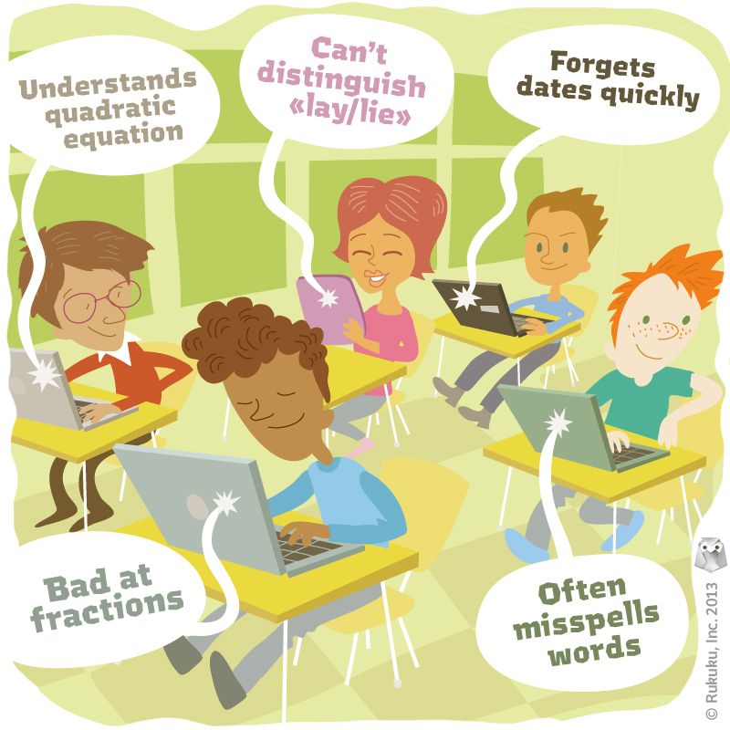
Imagine this. Students fill a classroom, each one sitting at his or her desk with a tablet or small laptop, working away at the particular topic of the hour, whether it be mathematics or history. The computer gauges each of the student’s responses, recording their performance and re-calibrating the lesson to focus on the student’s weak points. The teacher walks around, monitoring progress, identifying difficult topics, answering questions.

A few students smile, enjoying the game-like qualities of the educational programs, more fun than the lectures and quizzes of past classes. Everyone wins. The students have more fun while working at their own pace, and teachers still serve in essential roles. With all that winning, why does that image make me uncomfortable then?

Date in education helps personalize education

Technology allows teachers to better understand the individualized needs of their students.

Much of the excitement surrounding technology and education centers on accessibility. Students in rural India can now take classes from Harvard professors by simply saving enough money for a few hours a week in an internet café. That is exciting stuff, and at Rukuku, we hope to further facilitate the opening of new educational channels around the globe. At the other end of the spectrum, though, technology is creating new opportunities to understand the specific strengths, weaknesses, and educational needs of individual students. In other words, technology is not only making education more global, but more personal as well.

The value of this should be clear for any student that’s gotten hung up on one aspect of the lesson and fallen behind on the rest of the material as a result. That value should also be clear to any student that’s daydreamed away a class period while the teacher reviewed and rehashed old material for the sake of a few students that are still struggling to understand.

Picturing it, though, is a little discomforting. I see a room full of kids absorbed in their computer screens in the same way many kids are absorbed in computer or TV screens once they get home. Automated programs sit on the other side of those screens, rather than real people. Teachers serve as facilitators and tutors, not as the foci of attention. Few educators are fully comfortable with that picture either, and most pilot programs utilizing such technology limit daily use and offer that information to help teachers in their traditional classrooms as well.

To me, using computers and limiting computer use are both great ideas, but it will be difficult to maintain the proper balance, especially if it turns out that letting the students work on the computer a little longer might be a little lighter on the teachers’ work load and a little better for the test scores. I know, I know. All the teachers reading this are gasping. I used to be a teacher, though, and I know the pleasure of making it a video day now and then. And yes, we still used videos when I was teaching. It was not that long ago.

The point is, these computer programmers are smart. And they will eventually figure out how to consistently make test scores higher through these programs, even if it takes five or ten years. Does that mean students should be interacting with automated computer programs all day? Some of time, yes. All of the time, no. Reaching the right balance will be the challenge.

I work for a tech company and obviously see computer screens as potentially positive in many, many aspects of education and of life. At Rukuku, we are trying to connect people all over the world to fully develop that potential. At the same time, the social aspect is an important element in education, especially for children. We do our best to maintain that aspect by using old-fashioned data collectors, also known as teachers, while still taking advantage of technology to expand the reach of those teachers.

Individualized student data can and should be an important tool for teachers, and we are always exploring ways in which we can offer more highly personalized options for our users. At the end of the day, though, nothing replaces the personal interactions that students have with their teachers and each other, even if those interactions take place across electronic networks stretching from Silicon Valley to Himalayan mountaintops.

Power Law at Play in Interface Design

Rukuku design work is progressing full steam. In the process, we have discovered that interface design can be driven by the Power Law.

In early 20th century Vilfredo Pareto noticed a particular quality about incomes—in different towns around Europe, across many centuries, regardless of political systems, geographical location or anything else, incomes were distributed on a curve:

The graph illustrates that roughly 80% of wealth belongs to about 20% of people. And the remaining 80% of people collectively own the remaining 20% of societal wealth. This 80/20 rule magically works in many areas of life.

We discovered that when people post pictures and attach tags to them, 80% of pictures have fewer than 10 tags. Furthermore, any type of tagging activity on the web seems to follow the Pareto Law and 10 tags is the tagging capacity that should satisfy most of the users.

We concluded that if there is a need to limit the number of tags that a user can make in a software interface, most of the people will be satisfied with about a dozen.

User Interface colors

Color is a powerful tool in interface design.

Jef Raskin’s book I mentioned in my previous post devotes a long chapter to “Modes“. These are “a significant source of errors, confusion, unnecessary restrictions, and complexity in interfaces”. A simple example of mode would be how the “shift” key on your keyboard works:  pressing “Shift” with a letter key results in a capital letter, but “Shift” and a number key produces a completely different symbol.  The author talks about different modal interface features and suggests a number of ways to avoid modality in interfaces.

However there is very little about modality of color. There is cultural modality, i.e. colors have polar meanings in different cultures. For example, Chinese stock market data displays use green for falling prices, and red for raising prices as seen on the official Shenzhen Stock Exchange website:

Western tradition has it completely the opposite way, i.e. red means loss of value and green means growth in value as seen on Bloomberg.com:

If it weren’t for the triangles and the bars showing direction of the stock price movement, the colored numbers of the Shenzhen Stock Exchange alone would be confusing to most of the Western world, and the colored numbers on the Bloomberg website would confuse a lot of mainland Chinese.

Choosing colors for the interface should not be taken lightly as it can be a source of modality and sheer confusion.

At Rukuku, Inc, we are acutely aware of the ability of color to add modality to the interface, and we work hard to avoid such confusion. Our goal is to create the ultimate education marketplace that is a pleasure to use for anyone.