Color is a powerful tool in interface design.
Jef Raskin’s book I mentioned in my previous post devotes a long chapter to “Modes“. These are “a significant source of errors, confusion, unnecessary restrictions, and complexity in interfaces”. A simple example of mode would be how the “shift” key on your keyboard works: pressing “Shift” with a letter key results in a capital letter, but “Shift” and a number key produces a completely different symbol. The author talks about different modal interface features and suggests a number of ways to avoid modality in interfaces.
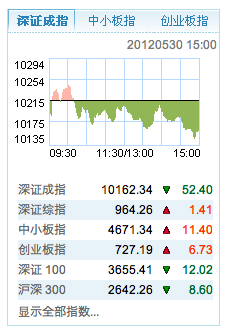
However there is very little about modality of color. There is cultural modality, i.e. colors have polar meanings in different cultures. For example, Chinese stock market data displays use green for falling prices, and red for raising prices as seen on the official Shenzhen Stock Exchange website:
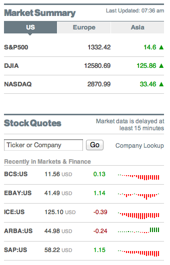
Western tradition has it completely the opposite way, i.e. red means loss of value and green means growth in value as seen on Bloomberg.com:
If it weren’t for the triangles and the bars showing direction of the stock price movement, the colored numbers of the Shenzhen Stock Exchange alone would be confusing to most of the Western world, and the colored numbers on the Bloomberg website would confuse a lot of mainland Chinese.
Choosing colors for the interface should not be taken lightly as it can be a source of modality and sheer confusion.
At Rukuku, Inc, we are acutely aware of the ability of color to add modality to the interface, and we work hard to avoid such confusion. Our goal is to create the ultimate education marketplace that is a pleasure to use for anyone.


